TrueLayer's Design System
Making a design system AI-ready
Designing the foundations for AI
As AI has become increasingly integral to the way we work in product, I believe a well-defined and developed design system is more important than ever.
Over the last year or so at TrueLayer, I focused on evolving our design system from a UI library into a much more structured source of truth, one that could support designers and engineers today, while also providing the foundations for AI-assisted product development.
A design system isn't just a collection of reusable components, it is a collection of decisions, relationships, rules and product knowledge. AI has just made that all more important and valuable.
That knowledge often lives implicitly in the heads of designers and engineers, or is spread across Figma files, codebases, documentation and individual team practices.
Creating a common language between design and code.
One of my biggest areas of focus is always improving the relationship between design and engineering.
I worked closely with engineering to bring greater alignment between the two, from naming and component structure through to states, behaviours and design tokens.
The objective wasn't to make Figma and code identical. Instead, it was to ensure they represented the same underlying system.
This became increasingly important as AI-assisted development became more capable. When an AI coding tool is asked to create an interface, the quality of the result depends heavily on the context it has available. A system with clearly defined components, tokens, naming conventions and behaviours gives AI something much more useful to work from than a collection of disconnected screenshots or loosely documented UI.
Making Figma more understandable.
I also started thinking about our Figma libraries differently.
Rather than treating Figma purely as a visual design environment, I treated the design system as structured information that could potentially be interpreted by AI.
That meant being much more intentional about:
component naming and hierarchy
variants and properties
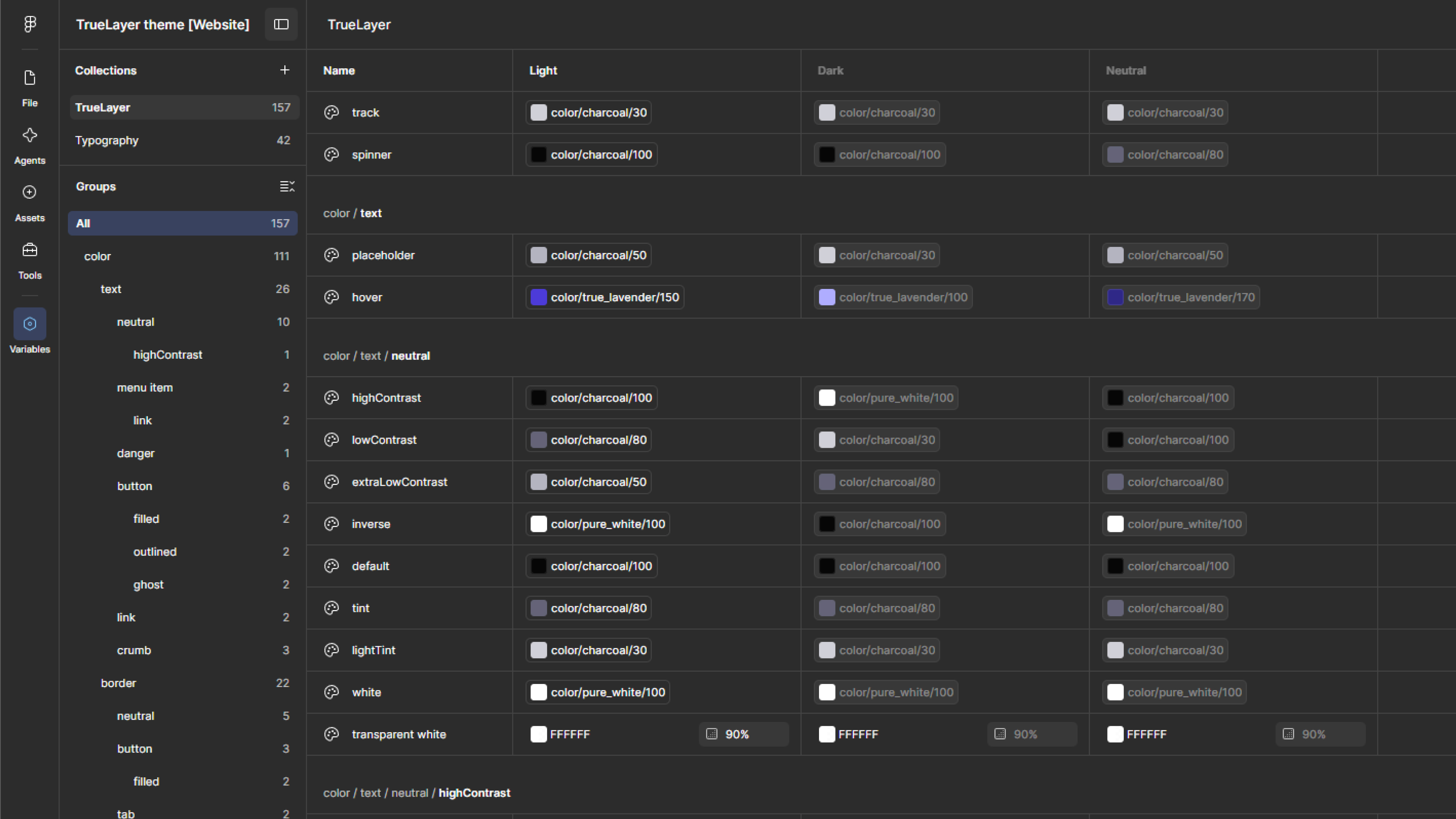
variables and design tokens
semantic relationships between components
consistent states and behaviours
reducing unnecessary duplication
making component intent and usage clearer
The goal was to make the system easier for designers to use, but also easier for AI tools to interpret.
This is an important distinction. An AI doesn't inherently understand why a component exists or when it should be used. We have to encode that knowledge into the system.
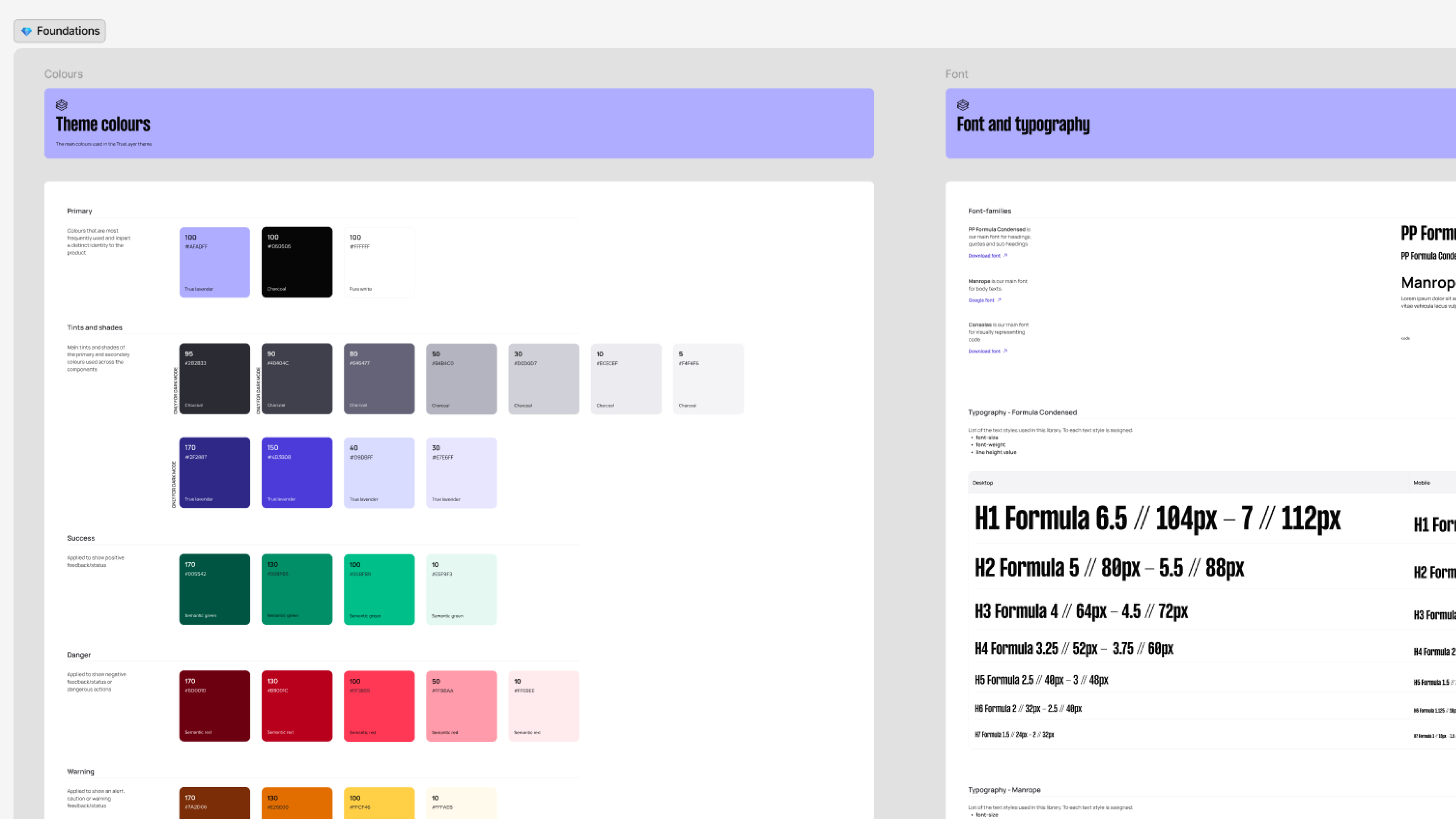
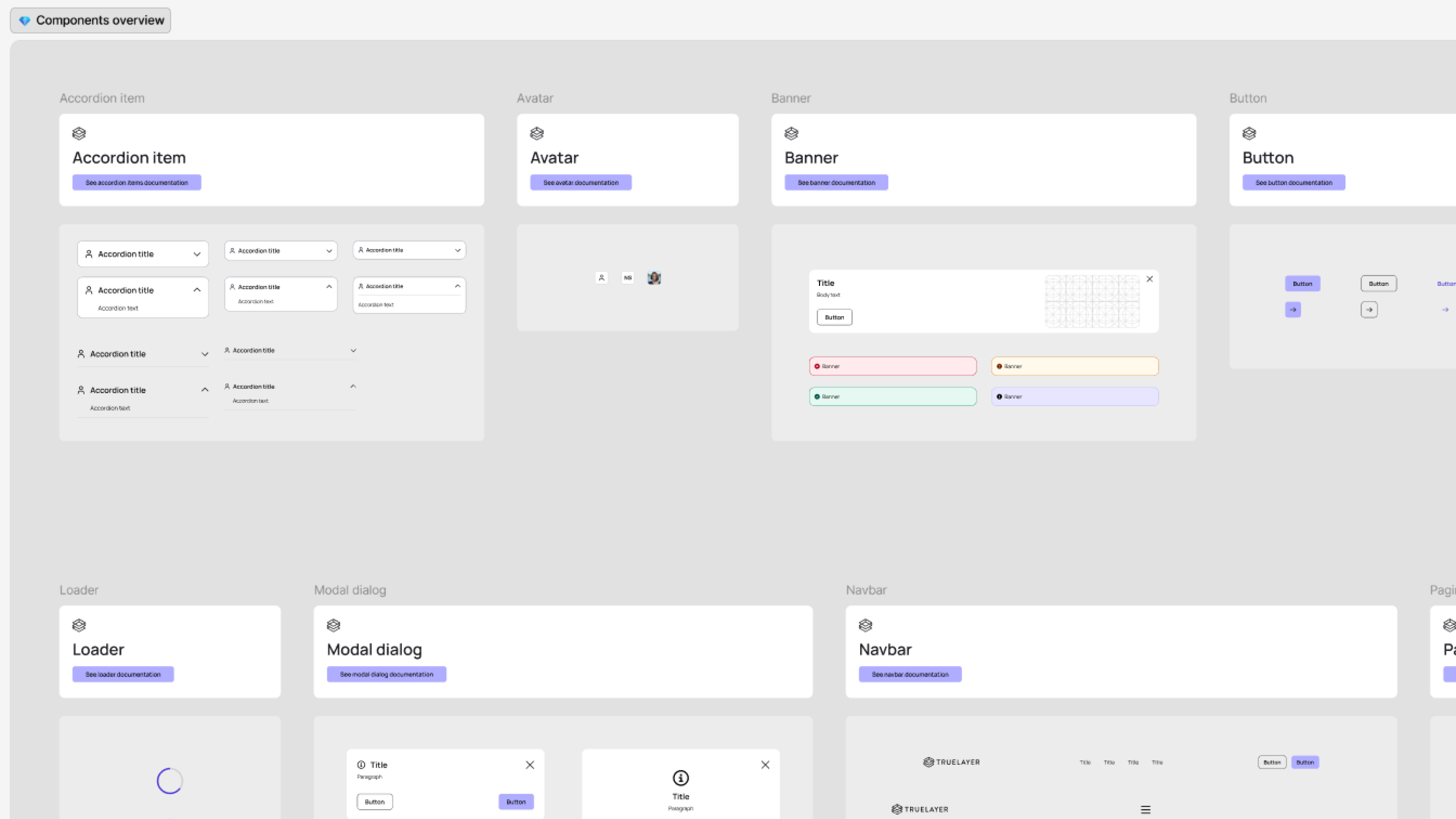
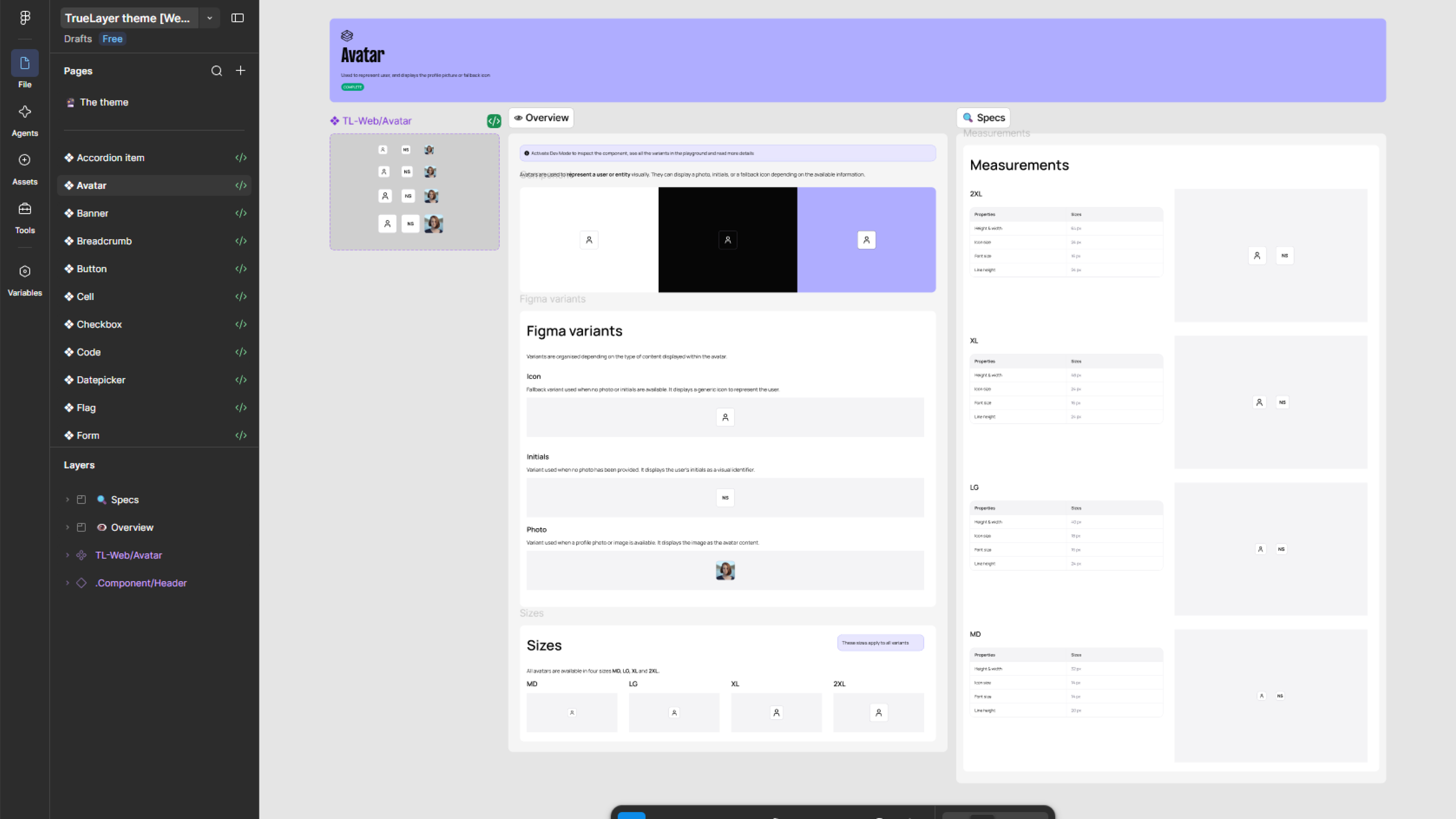
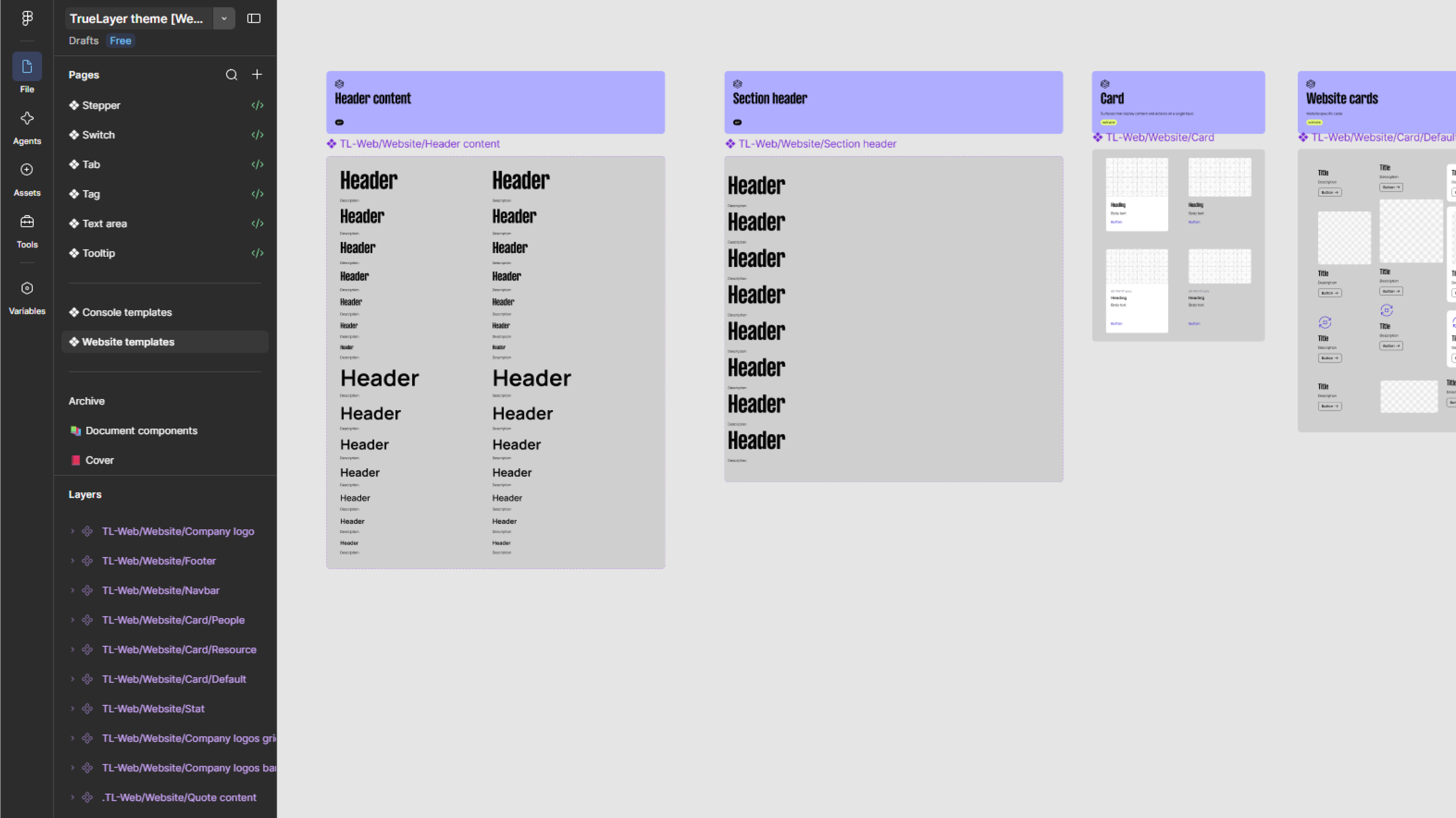
Turning documentation into knowledge
Documentation became another important part of this work.
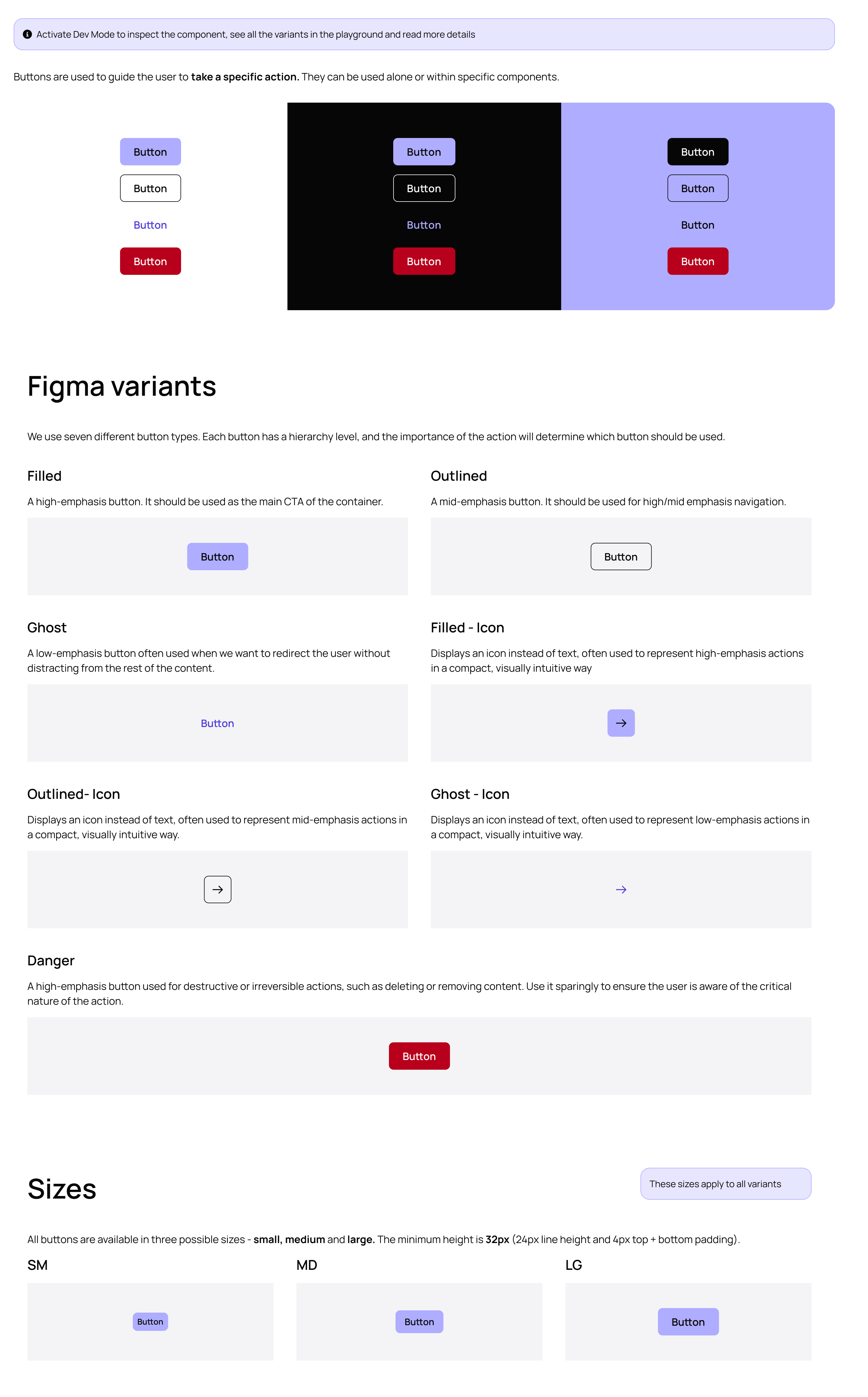
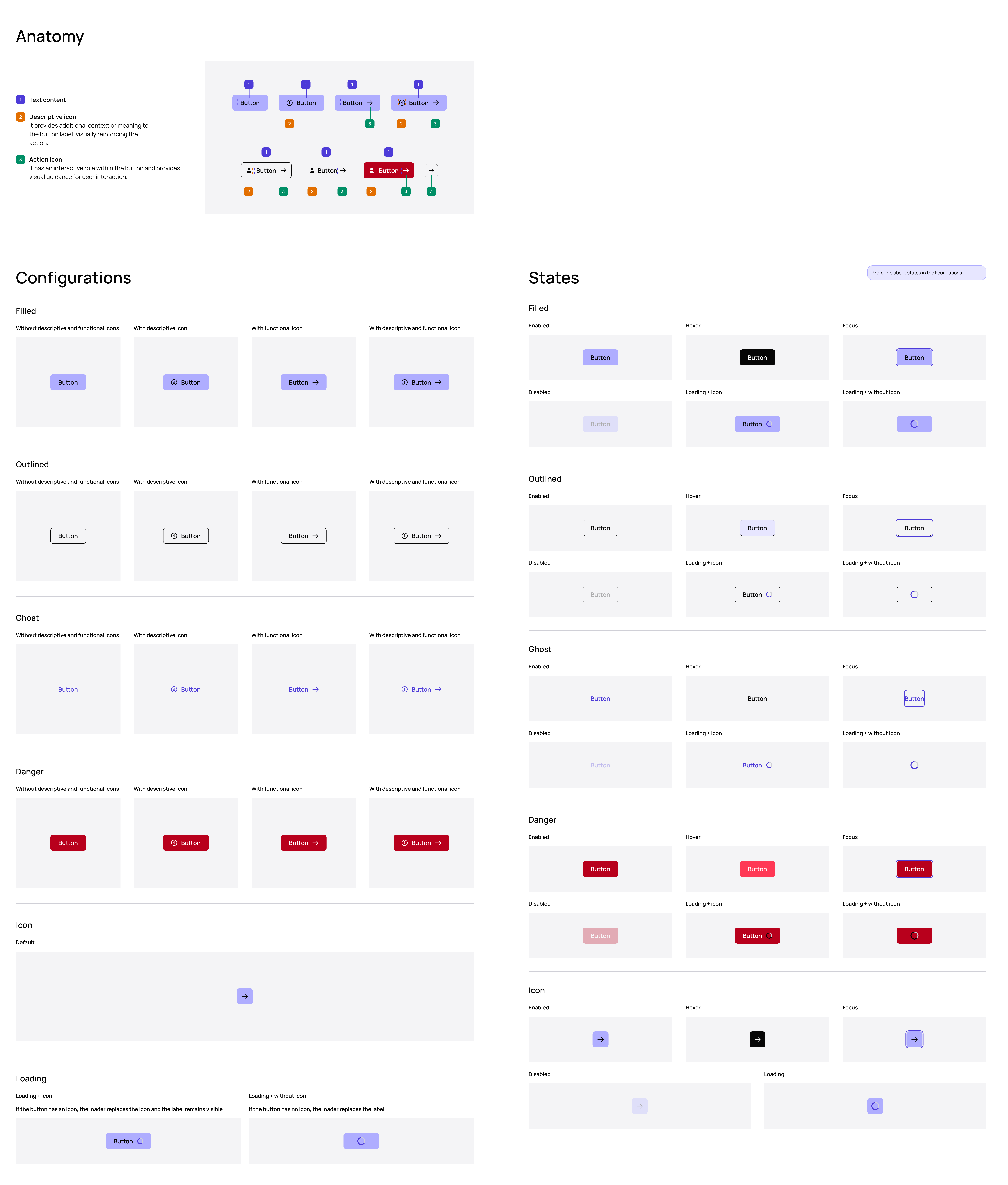
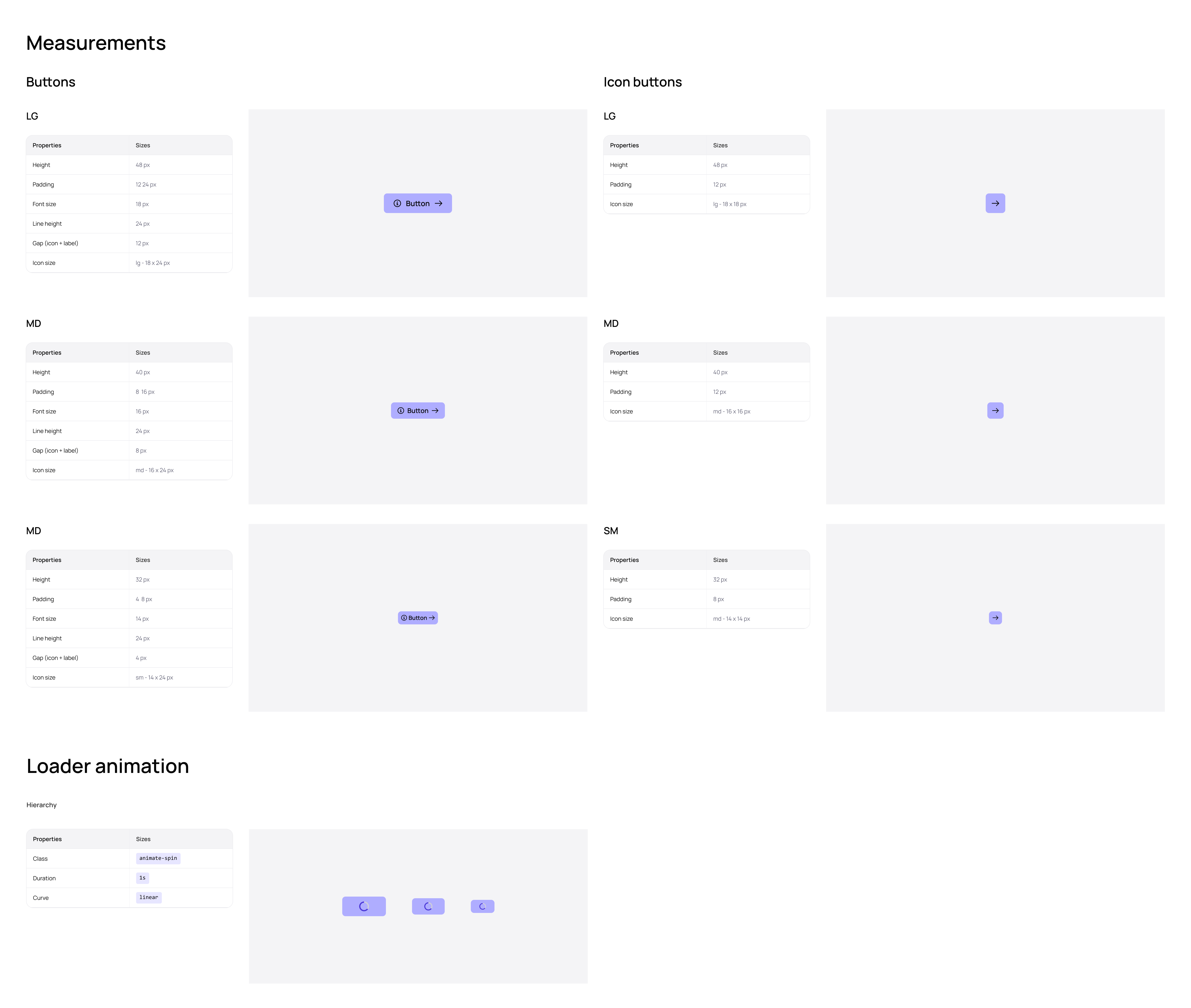
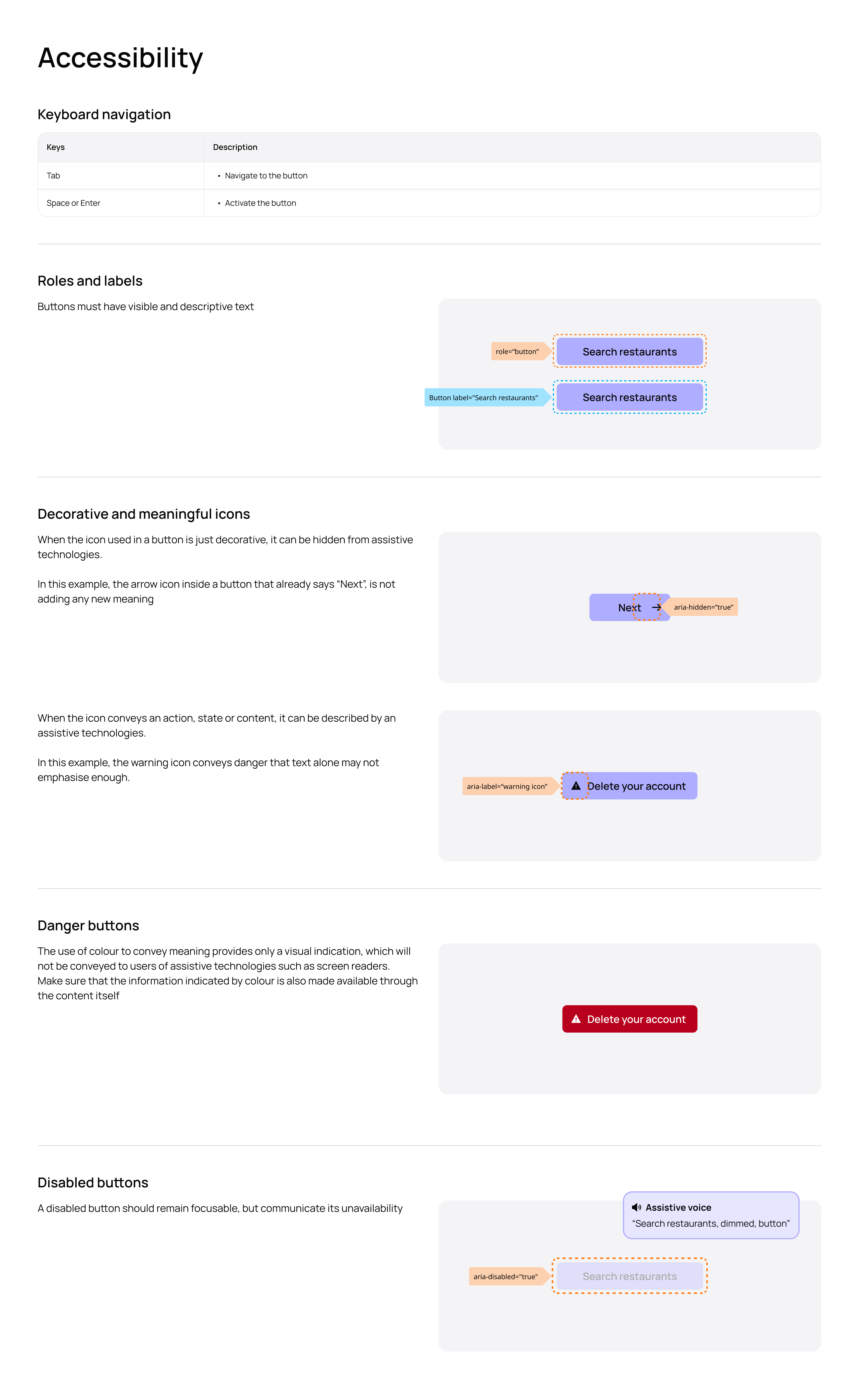
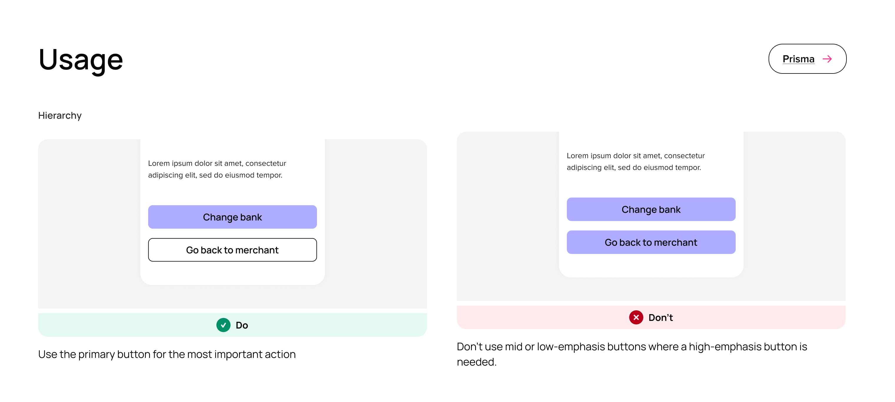
Rather than documentation simply explaining what a component looks like, I focused on capturing the decisions behind it: when to use something, when not to use it, how it behaves, what its states are, and how it relates to other patterns.
This helped make previously implicit knowledge explicit.
It also created a much stronger foundation for AI-assisted workflows. Good documentation isn't just useful for onboarding a designer or engineer; it becomes contextual information that can help an AI system make better decisions.
In that sense, I started thinking about documentation less as an instruction manual and more as a knowledge layer for the design system.
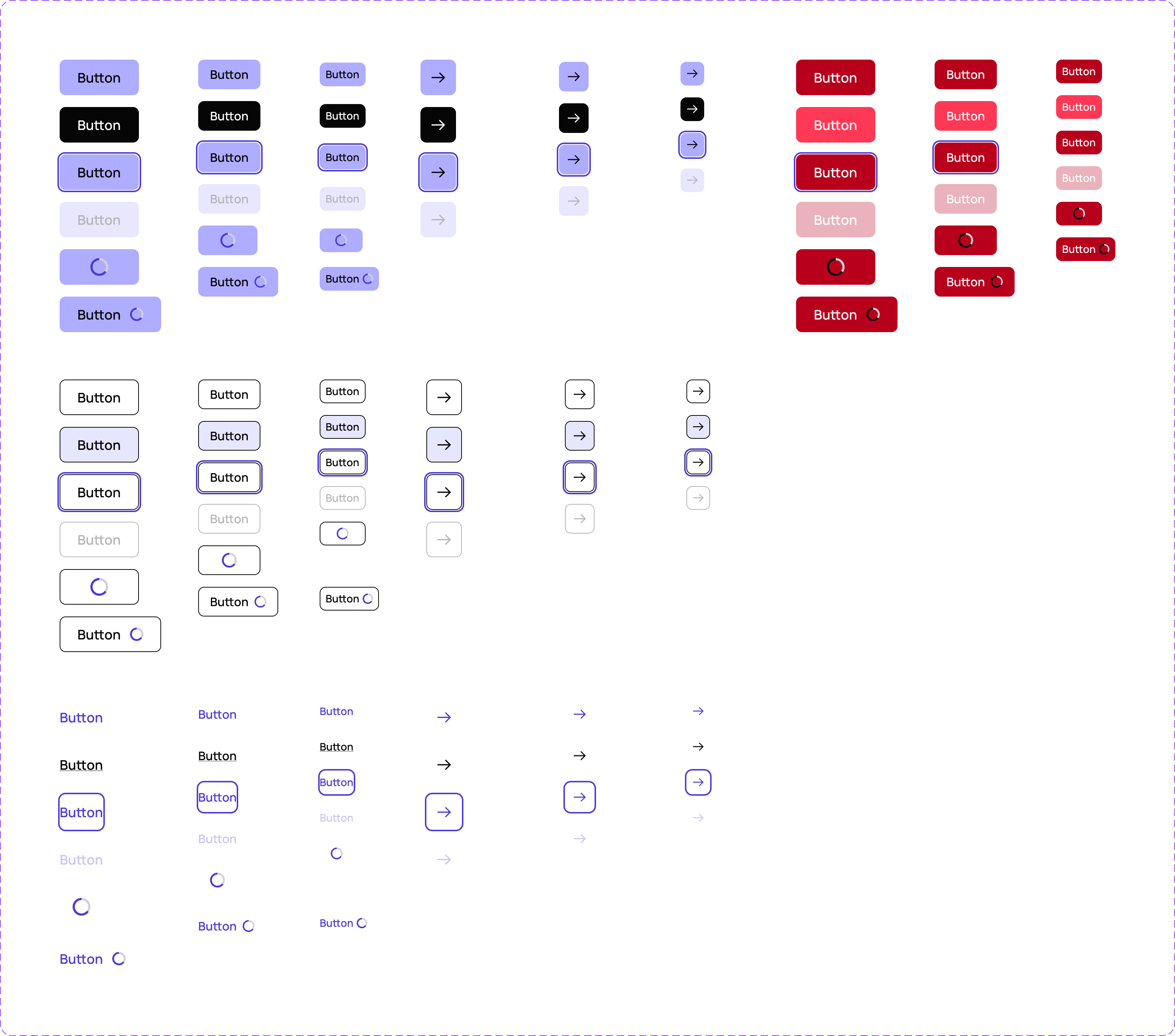
Below is an example of the button component documentation. See it on Figma here
A token-based foundation
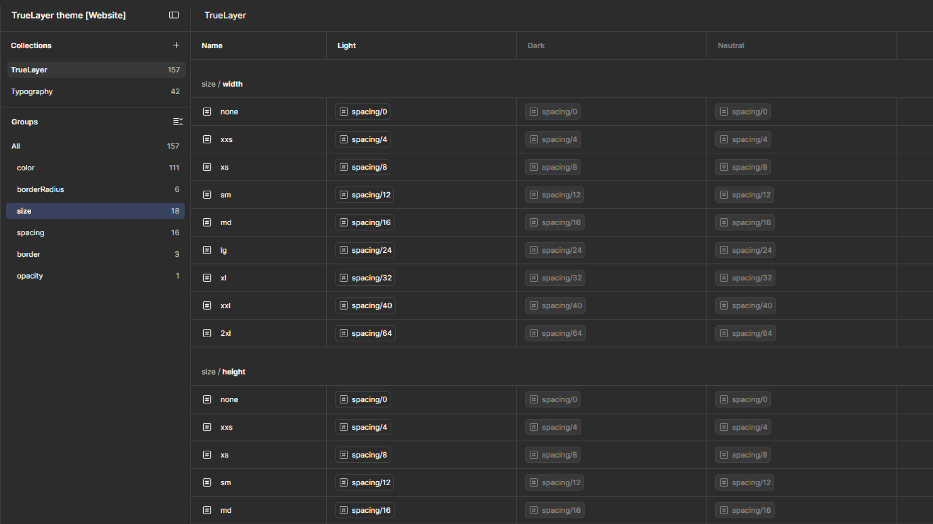
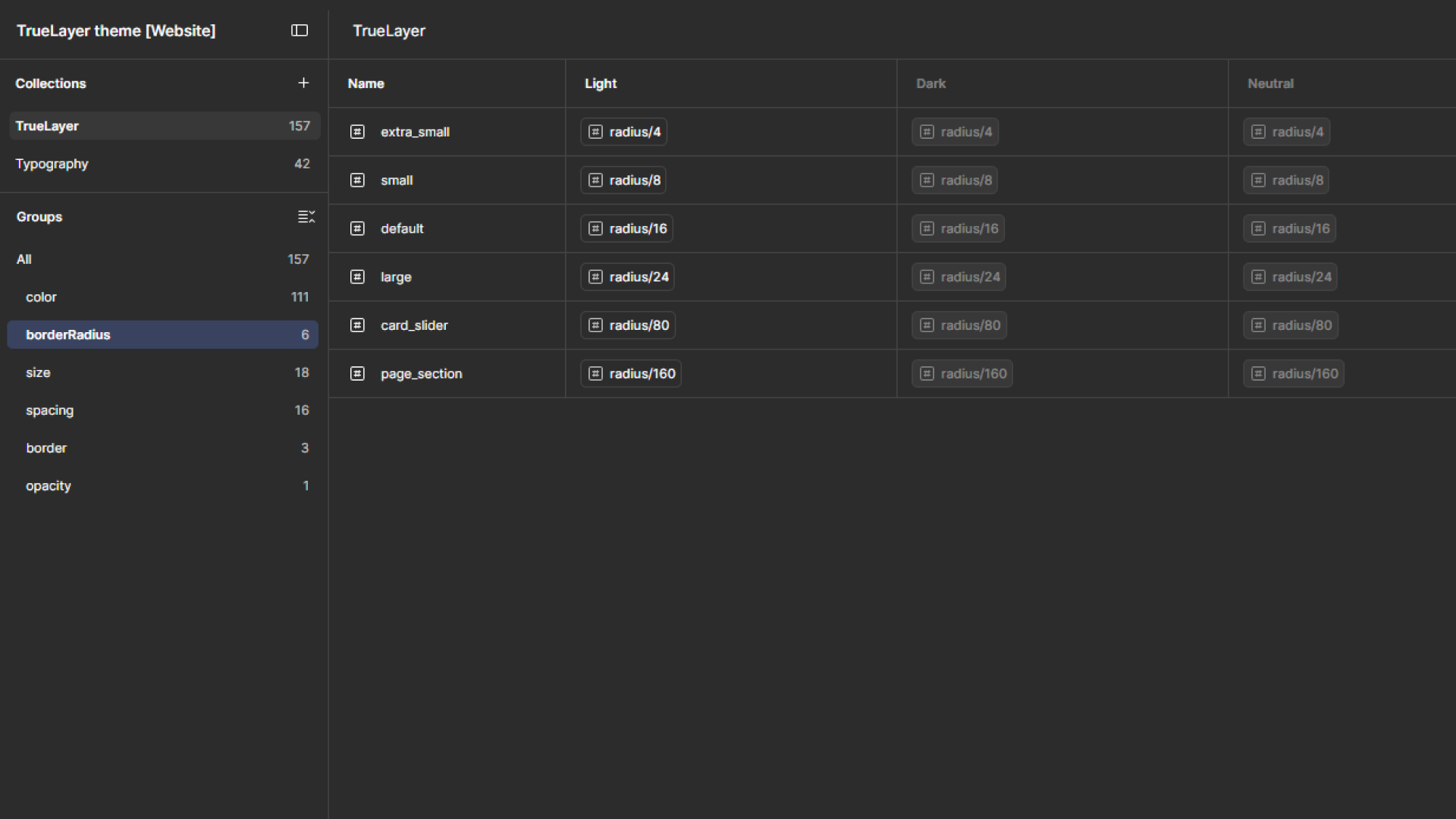
I worked towards a more structured token architecture so that decisions around colour, typography, spacing, sizing and other foundations could be represented semantically rather than simply as isolated visual values.
This created a stronger connection between design and engineering and made the system more resilient as it evolved.
Instead of asking AI to infer which shade, spacing value or typography style should be used from a visual reference, we could give it a defined vocabulary and set of constraints.
Components to patterns
I also expanded the focus of the system beyond individual components.
Components solve relatively small problems. Patterns capture how those components should be combined to solve common product problems.
For example, rather than simply documenting a button, input or modal independently, the system could describe how those elements work together within a particular product interaction.
This was particularly important because AI is increasingly capable of generating complete interfaces rather than individual UI elements.
If we only give AI a component library, it can generate technically valid components while still producing poor product experiences. Giving it patterns, principles and established interaction models provides much richer context.
Experimenting with AI alongside engineering
A lot of this work was also experimental.
I worked in partnership with engineering to explore where AI could realistically fit into our design-system workflows, rather than treating AI as something that designers could independently bolt onto the process.
That experimentation also highlighted an important principle: AI amplifies the quality of the system it is given.
Where our conventions were clear, AI could work within them. Where there was ambiguity, duplication or missing context, AI exposed those weaknesses very quickly.
This made AI experimentation useful not just as a productivity exercise, but as a way of stress-testing the design system itself.
The bigger shift
I've always thought of design systems as more than libraries of reusable UI. At their best, they are a form of structured product knowledge capturing decisions, principles, patterns and relationships that help teams make better products consistently.
What has changed for me is how much more important that structure becomes when you're designing for both people and AI.
Designers and engineers have always relied on the system to understand how and why things should be built. But as AI becomes part of the way we design, prototype and develop products, that same knowledge can increasingly be consumed, interpreted and acted upon by machines.
That has made me much more conscious of the quality, structure and accessibility of the knowledge we're putting into a design system. Ambiguity that might once have been resolved through a conversation between a designer and engineer can become a much bigger problem when we're asking AI to make decisions from the same system.
For me, this doesn't mean designing a system specifically for AI. It means building a better system full stop — one where the principles, patterns, tokens, components and documentation are clear enough to support people, while structured enough to give AI meaningful context.
That was ultimately the direction I wanted to take TrueLayer's design system: making it a stronger shared foundation for the organisation, and one that could support the way both people and AI increasingly contribute to how products are designed and built.
How it started
When I joined TrueLayer, we had a legacy component library built in Sketch. The team was fantastic and deeply cared about consistency and scalable design, but as a small team, design system upkeep had fallen by the wayside. Creating a team was our first step toward fixing that.
Scaling a multi theme design system infrastructure
Back in 2019, as TrueLayer expanded rapidly, we set out to build Prisma—our centralized design system covering brand assets, product components, and production code tokens.
As Design System Lead, my goal was not just to create UI components in Figma, but to build scalable, multi-theme architecture that empowered product teams while keeping user experience consistent across 10B+ annual transactions.
Key Outcomes & Deliverables
System Migration & Architecture: Transitioned design operations from legacy Sketch files to scalable Figma component libraries across 6 distinct themes (Developer & End-User experiences).
In-Tool Designer UX: Built inline Figma guides and standardized variant structures, significantly reducing onboarding times and component usage friction for design squads.
Token Architecture & Multi-Theme Alignment: Partnered closely with frontend engineering to align design tokens (using Figma Variables) with React component libraries for seamless codebase adoption.
Establishing Our Process
Rather than trying to patch together legacy files, we set out to build a modern design system from the ground up:
Comprehensive Audit: We gathered every existing UI style, component variant, and screen across our live products to map our current baseline.
Consolidation: We evaluated the audit to identify key UX inconsistencies, technical debt, and visual drift across teams.
Starting Fresh: Instead of patching together a "Frankenstein" library, we chose to build a clean, unified system designed for long-term scalability across both design and engineering.
Migrating to Figma: We evaluated our tooling and decided to migrate the company from Sketch to Figma. After consulting stakeholders across product and engineering, we chose Figma to foster real-time collaboration.
Architecting Multi-Audience Themes: TrueLayer's products serve distinct audiences from technical developers to end consumers. To meet that need, we introduced a multiple themed architecture. This allowed us to apply tailored visual styling for different user groups while preserving unified underlying UX patterns and structures.
Unblocking Design Teams
Building a design system while active product work is in flight is always a balancing act—product delivery couldn't pause for months while we built new components. To deliver value immediately without disrupting active sprints, we took a phased approach:
Prioritisation: We partnered with product teams to build a component priority matrix. By evaluating company demand, usage frequency, and implementation difficulty, we focused our efforts on the highest-impact themes and core components first.
Parity-First Rebuild: For the initial rollout, we deliberately recreated existing components without making sweeping visual changes. This ensured immediate alignment between Figma and live production code, allowing designers to adopt the new library instantly without creating technical debt or overhead for developers.
Below is a sample of core components from our Developer and Consumer themes. Our ecosystem has since expanded to 6 themes a complexity we are actively streamlining through consolidated design tokens.


How it continued
Building a design system is never a one-time project; it is an evolving product that matures alongside the business. As I stepped into a leadership role managing TrueLayer’s design system, I quickly realized that true scale requires far more than just maintaining Figma UI kits.
Design system leadership operates in constant ambiguity. A system must serve as the single source of truth and a guiding light for quality across product, brand, and engineering. However, governance shouldn't shackle creativity. The ultimate goal of a design system is to elevate overall experience design—freeing teams to experiment and innovate without sacrificing core UX patterns or visual consistency.
While a large portion of my role involves guiding cross-functional execution, our core impact is delivered through three key pillars:
Scalable Infrastructure: As "designers for designers," our internal UX must be flawless. We continuously refactor our libraries to leverage advanced Figma features (such as Auto Layout, Component Variants, and Variables), saving design squads hundreds of hours in production time.
In-context Documentation: Clear, accessible guidance is vital for adoption. Alongside our central documentation platform, we embedded interactive, in-Figma usage guides directly into the component canvas—allowing designers to access specs and best practices without breaking their flow.
Cross-Functionality: Beyond tangible assets, our most crucial output is alignment. By positioning our team as design stewards, we partner closely with product, brand, and engineering to maintain high quality standards across every screen and touchpoint.


